Landscapes are one of my favourite things to paint and I’m always drawn to artworks that have depth and atmosphere that transport you to the same spot as the artist. Regardless of if it is an urban cityscape or mountain range with lakes and rivers, for me good landscape paintings capture the ‘feeling’ of a place. So whether you’re painting one for the first time or looking to take your painting to the next level, here are some of my quick tips shared below.
Always Have a Plan
So many artists get caught up in the detail of the scene they are painting. Feverishly working on tiny intricate areas before they have even worked out the general composition and realise their perspective is incorrect.
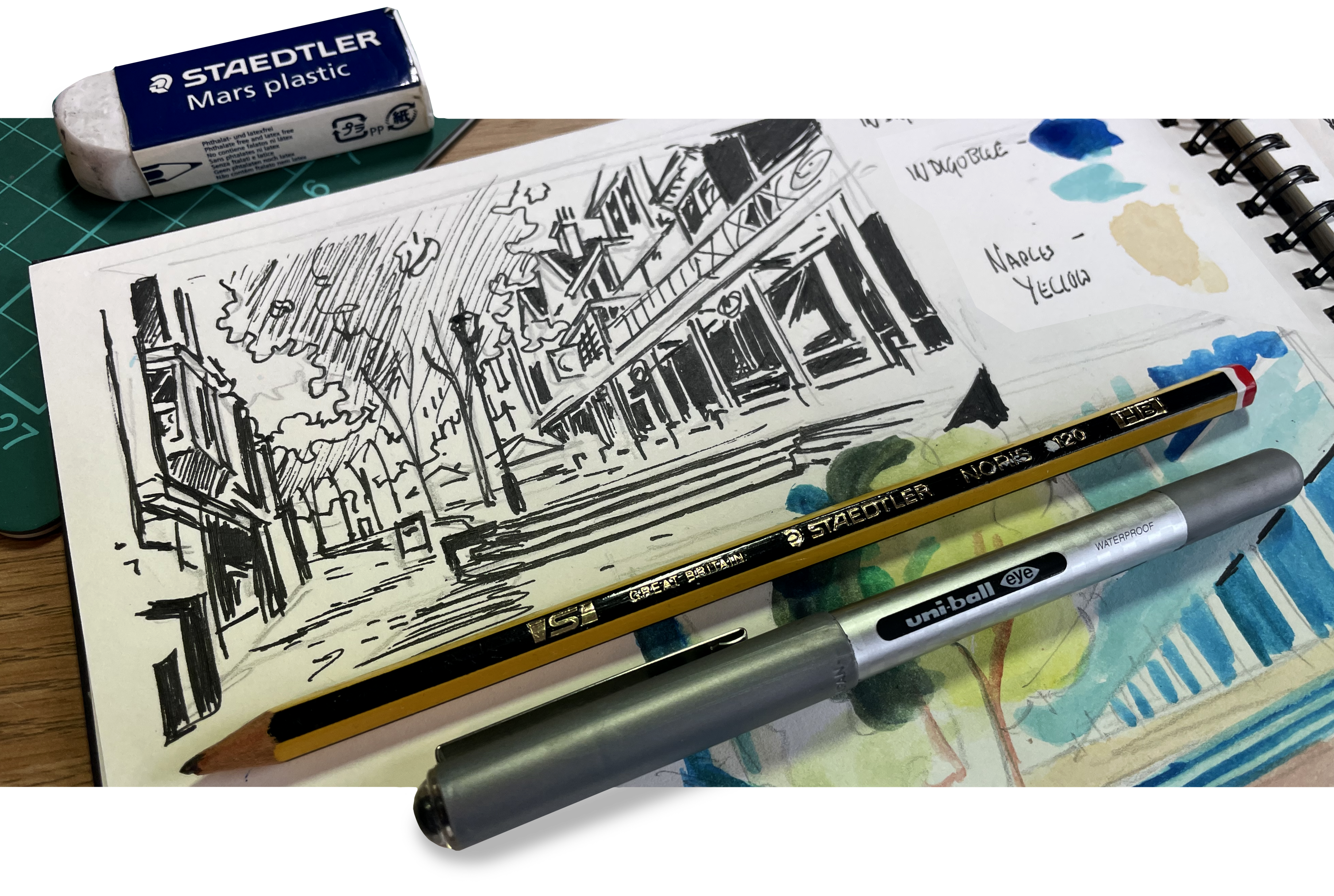
Your final artwork will be easier to resolve if you step back and construct it out of simple shapes and forms before zeroing in on details. A trick to help achieve this is by producing a thumbnail sketch or value study before you start. It is also a great way to plan your artwork and preemptively solve many issues like proportions and perspective before they arise.
Don’t be afraid to edit the view for an improved final result too! It may sound cheeky but as artists we don’t have to replicate reality literally but can move trees, buildings and even mountains to create a stronger final piece. So when planning your artwork this is a great chance to reduce the clutter and improve on real life. If you don’t like how something is positioned then move it or extract it entirely. Alternatively if a scene would benefit from an extra tree or plant pot add them in!
Select Your Colours To Set The Mood
For me colour is a wonderful gift to artists for us to play with and I’m a sucker for using paint straight from the tube. However we have to consider which colours we select and how we apply them correctly. If we are not careful our artwork can become visually overwhelming.
Imagine a busy restaurant or cafe, patrons talking and eating loudly, children running between the tables, the clatter of chaos and crockery in the kitchen. While the waiting staff yell at each other that ‘table five needs to be cleaned up before the coach party arrives and can someone PLEASE ANSWER THAT RINGING TELEPHONE!’. With every element conflicting and shouting to be heard over the noise in this scene, it’s impossible for one voice to stand out. The same goes for our art, too many competing over-saturated colours, complex shapes, messy textures and applied with no clear intention. It creates visual noise and is a quick way to give you and viewers an eye strain headache.
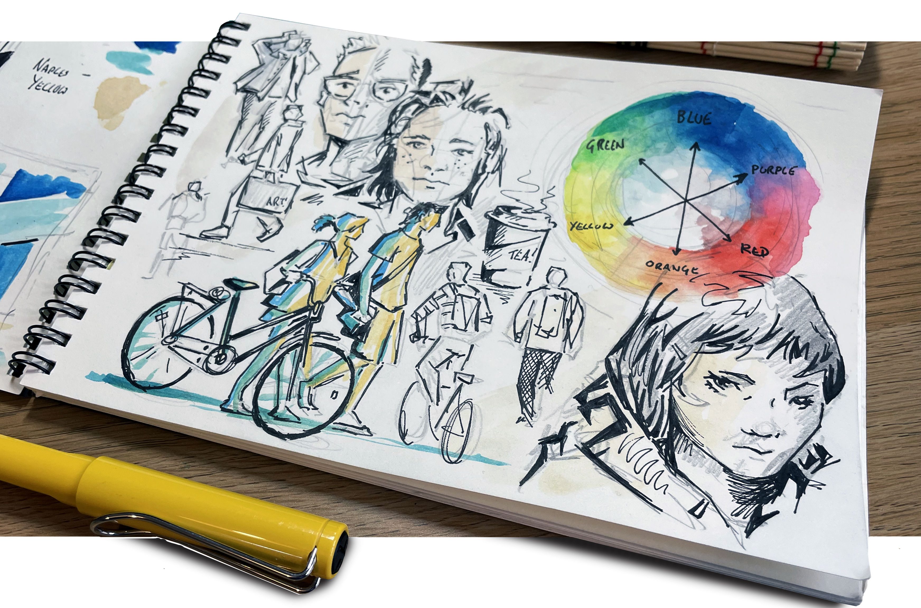
Instead, consider what the overall base colour of your artwork will be. An analogous colour scheme uses three or more colours that sit next to one another on the colour wheel which can make for a subtle and harmonious pallet to work with. Alternatively, a great way to draw focus to an area is by using a Complementary Colour Scheme of hues sitting opposite of each other on the colour wheel. For example if your artwork is predominantly made of dark cool blues then make your main subject or highlights from lighter warm oranges to draw focus. The same goes for Yellow and Purple and so on.
Bonus tip: I like to choose one colour to be dominant and use the rest of the colours as subordinate. In other words, colours are more interesting when they are used in unequal amounts. This gives a painting an overall mood and feeling as a painting that is 50% red and 50% green will not convey an overall mood as effectively as a painting where one colour dominates.
Use Your Biggest Brush To Block It In
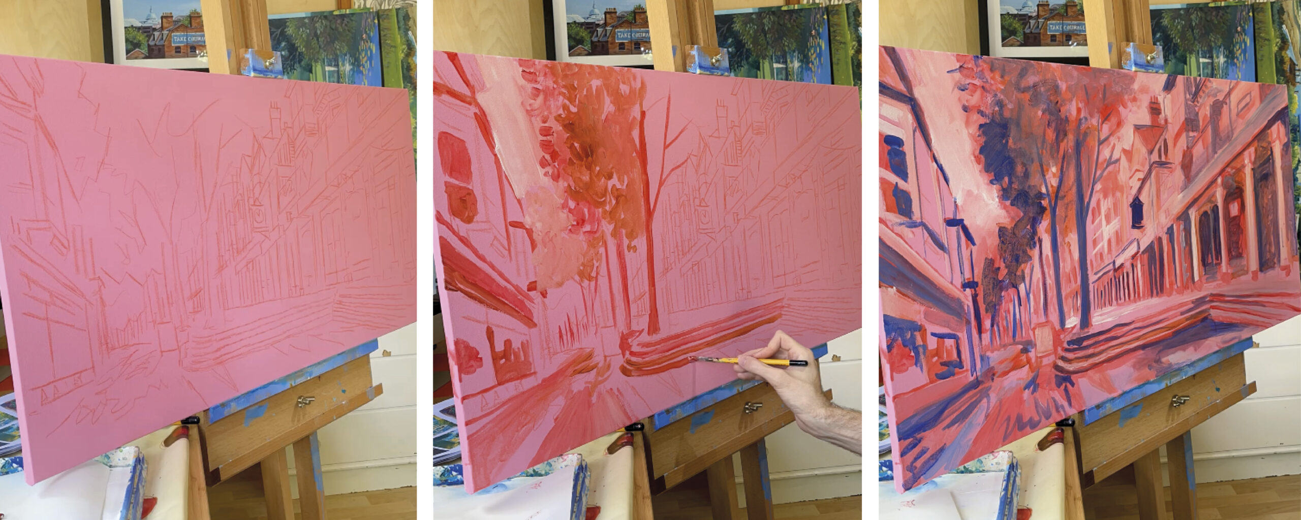
Once you’ve made your plan and selected your colours it’s time to start painting! I highly recommend larger flat or mop brushes for blocking in your colours, as this removes the temptation to focus on details before we should.
In landscape painting, you will come across many situations where it is much better to give the illusion of numbers rather than to try and paint every individual object. For example, if you have a row of trees, you should not try and paint every individual leaf. That would be a fast track to artistic burnout or insanity. Rather, you should paint the general shapes and tones, then detail just a few branches. This will make it look real without having to paint every single detail. The human eye is naturally inclined to find definition in even the vaguest of shapes, as artists we can often get away with adding fewer details and focusing on expressive brushstrokes instead. 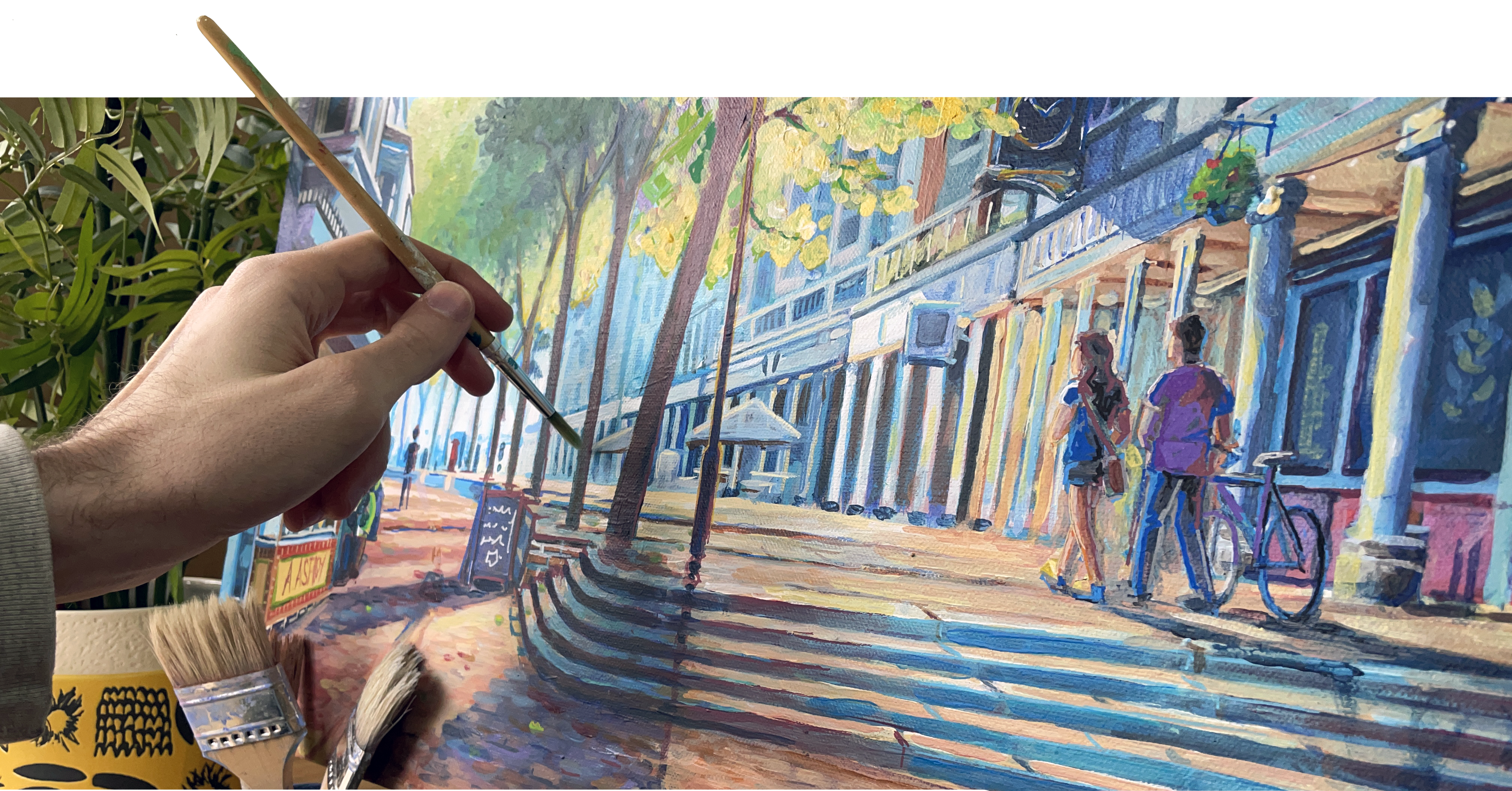
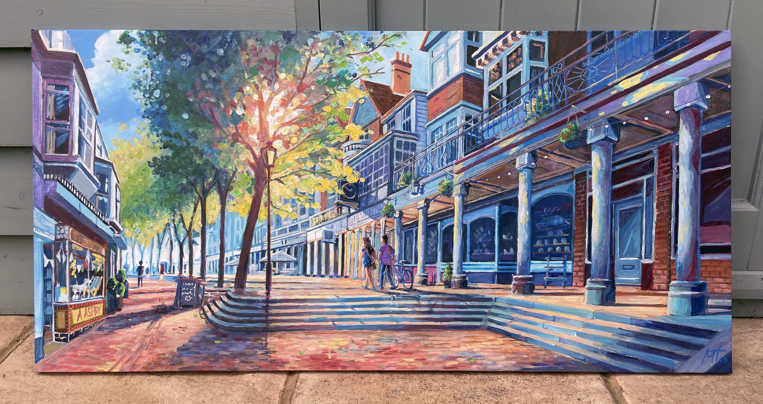
Refine the edges, build texture and add the details
With your artwork blocked in and reading cleanly thanks to your well considered planning, the final step is to define your focal point or foreground. Landscape paintings can look messy without a focal point. So identify the most important part of your painting or the area on which you want viewers to focus. Maybe it’s the tallest mountain in the range. Maybe it’s a tree or figures in the foreground.
Add more details and sharpen the edges which will contrast well with the “looser” background. It also helps to give the illusion of depth and make your foreground stand out. You can always revisit or rework your background or add more details later if needed, but this is all part of the fun push and pull process of creating art. Use more delicate brushwork on your focal point or use brighter or more saturated colours in that area too. By creating a defined subject between the focal point and the rest of the scene using it will naturally give your views somewhere to look.
It Is All Just Shapes, Lines and Colours
This goes for every type of painting now matter how simple or complex. You should try to think about the elements in your scene not as clouds, trees, water and grass but rather as various shapes, lines and colours. If you focus on painting these elements as we broke them down then you should (with proper execution) have a painting that looks like your landscape and a work of art you can be proud of.
There’s always something new to learn so explore and play around. See what works best for you and your art! If you’re interested in learning more about my creative process, feel free to subscribe to my email newsletter, follow my Instagram or check out my Landscape painting course on Domestika for more tips and tutorials!
I can’t wait to see what you create. Happy painting!